|
|
Post by Catherine Sun Chips on Jan 23, 2012 8:43:22 GMT -8
I dig it. Props  |
|
|
|
Post by Switch on Jan 23, 2012 16:27:15 GMT -8
I had bigger plans for this animation but I just didn't want to spend that much time on it. So here is what I made. It is subtle, not my best work, but it is animated at least. It's a poopy ride to Sasquatch, wowzers.  |
|
|
|
Post by Pea on Jan 23, 2012 16:33:33 GMT -8
I LOVE THAT!
|
|
|
|
Post by Friendly Destroyer on Jan 23, 2012 16:34:51 GMT -8
I love this blue by the way. Makes me happy.
|
|
|
|
Post by emptyfox on Jan 23, 2012 17:13:58 GMT -8
Amazing work switch!
Sigh... anyway you can shrink it?
|
|
|
|
Post by Pea on Jan 23, 2012 17:23:34 GMT -8
Hahaha it is a bit large...
|
|
|
|
Post by Switch on Jan 23, 2012 17:24:11 GMT -8
is this still too big?  |
|
|
|
Post by emptyfox on Jan 23, 2012 17:25:01 GMT -8
Ya, and I'm dumb and didn't copy the link HG used initially before adding that one. I'm looking into resize options but they're a bitch so far and any successful attempts actually look awful.
|
|
|
|
Post by emptyfox on Jan 23, 2012 17:26:45 GMT -8
That's a lot better Switch... I dunno, what do you guys think?
|
|
|
|
Post by Switch on Jan 23, 2012 17:27:33 GMT -8
Maybe this? 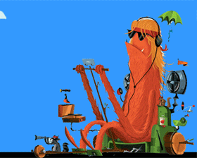 |
|
|
|
Post by emptyfox on Jan 23, 2012 17:29:28 GMT -8
Option 3 it is! Thanks a lot switch!
|
|
|
|
Post by Switch on Jan 23, 2012 17:31:42 GMT -8
No problem. I hope everyone enjoys it! Some of the original graphic got erased when I was trying to isolate it so it's not perfect, but hey I am still an amateur.
|
|
|
|
Post by Pea on Jan 23, 2012 17:36:00 GMT -8
If you guys don't like this or if it's too much to put together, I totally understand, but how about a small Sasquatch logo in the upper left of the graphic? Kind of like this...  |
|
|
|
Post by emptyfox on Jan 23, 2012 17:42:02 GMT -8
You have all of the pieces pea, so go for it! I would love to say we could have a seperate logo, but only one photo can go in that area.
|
|
|
|
Post by Switch on Jan 23, 2012 17:46:28 GMT -8
I like it actually. I was thinking that there was too much empty space. I was almost thinking of adding trees or something as well because it's kind of blank. Let me work on it later and see what I can do.
|
|
|
|
Post by Pea on Jan 23, 2012 17:46:36 GMT -8
Hah! I WISH I knew how to insert the logo over the animated gif. I'm only good with basic photoshop stuff :/
EDIT: Sweet, Switch!
|
|
|
|
Post by Horned Gramma on Jan 23, 2012 18:00:41 GMT -8
Beautiful dude. For seriously.
|
|
|
|
Post by know ID yuh on Jan 23, 2012 18:37:10 GMT -8
Dark blue text with a light blue background is too tough to read, especially when I'm reading on my phone. I can't read the user name, or the username/timestamp text when a post is quoted. It's much easier on the eyes when there is no quote since all the text is white. All the text was white before the change.
It looks nice, but would look really sharp if the royal blue text was white. It's like a jersey in sports, almost all colored jerseys have white text so the name and number are easy to read. The white jerseys have black text for the same reason. There are few exception (yellow on green and vice versus, purple on yellow and vice versus). While I'm betting maybe ya'll can find one, I couldn't find a jersey with the background and name/number a variation of the same color. Just click on a forum, and look how the thread page numbers are blue, with the comma/periods white. It doesn't look right.
EDIT: Changed post since the black text looks nice, it's the blue that is not easy on the eyes.
|
|
|
|
Post by Switch on Jan 23, 2012 20:16:52 GMT -8
I can't for the life of me figure out how to get the logo into the gif layers. The only way I could get the logo in there would be to do the whole thing over again. I am not an expert on this so there might be something that I just don't know or understand about it.
So for now we will have to use the animation I made. If I get into a creative mood again maybe I will remake it with a logo and maybe some trees as well. There are still a few months until the festival so I have some time.
|
|
|
|
Post by StormyPinkness on Jan 24, 2012 8:35:03 GMT -8
I like the gif with the open sky. Just like out at Sasquatch. Sometimes less is more.
|
|