|
|
Post by Lump on Dec 8, 2011 17:52:47 GMT -8
My crackpot theory on Rick Perry:
Rick's friend first bets him he wouldn't run for president. Well, Rick Perry, being the man he is, didn't want to look foolish (he's obviously very careful with that), so he ran to prove his friend wrong. But then he came to an epiphany realizing, "What the fuck am I doing? Am I really going to run for president based on a bet? How do I get out of this yet not look like a wimp to my friends? I KNOW! I'll run an ad campaign that will kill two birds with one stone: It will bluntly bash gays AND make sure that no one but the worst right-wing fanatics vote for me!"
|
|
|
|
Post by Fig on Dec 8, 2011 21:48:31 GMT -8
Occupy Boise made national PBS tonight with some pretty good coverage that offers a bit of insight into how we have been able to sustain ourselves and have yet to have a confrontation with the police: OccupyBOI coverage begins around 5:30...you can see me periodically throughout leading chants until I'm hoarse and at one point, I am seen in the background of an interview pulling my pants up and or picking a wedgie. Here is another article that speaks very highly of OccupyBOI: politics.salon.com/2011/12/09/fear_and_occupation_in_red_america/singleton/ |
|
|
|
Post by Fig on Dec 8, 2011 22:05:13 GMT -8
|
|
|
|
Post by davers on Dec 12, 2011 17:09:42 GMT -8
|
|
|
|
Post by Friendly Destroyer on Dec 12, 2011 17:18:05 GMT -8
I heard he was looking to try out a trampoline. |
|
|
|
Post by romanticizer on Dec 18, 2011 19:18:43 GMT -8
 Kim Jong Il is dead. |
|
|
|
Post by Pea on Dec 18, 2011 19:37:13 GMT -8
whoa!
|
|
|
|
Post by J. Walter Weatherman on Dec 19, 2011 18:28:05 GMT -8
And a bunch of people THOUGHT Lil' Kim died! But were relieved to find out it was only Kim Jong Il... What a sirry mistake.
|
|
|
|
Post by davers on Jan 4, 2012 10:19:42 GMT -8
I know most people dont even care about this, but I found it pretty interesting. Vancouver released it's home assessments a few days ago and the line between the "have a shit ton' and 'have less than a shit ton' is absoutly amazing. Blue dots indicate houses worth more that $1million and red dots indicate houses worth less than $1million. Appartments arent on here, which is why downtown is virtually empty. 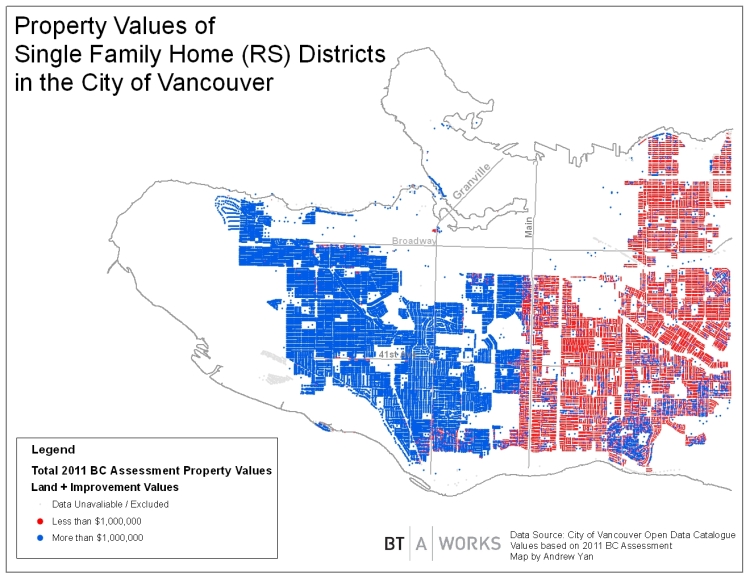 The interesting thing is that the clearly defined line between the reds and the blues happens to be the street that is the middle of the city. Every address on the left is the West (rich) half of Vancouver and the right is the East (less rich) half of Vancouver. I knew Vancouver was a very status heavy city, but holy balls I had no idea having a W in your address was worth so much more than having an E in your address. |
|
|
|
Post by Pea on Jan 4, 2012 10:23:50 GMT -8
They should probably put up a fence.
|
|
|
|
Post by romanticizer on Jan 4, 2012 10:27:56 GMT -8
Very interesting that class demographics are divided by a street. In many cities there is a "Division St./Ave./Blvd." and these were historically used to just this - divide groups. I would like to see a similar layout based on some other factors like families vs. single citizens, gender and race to see how much those play into it or its just geographic.
Thanks for sharing.
|
|
|
|
Post by know ID yuh on Jan 4, 2012 10:37:57 GMT -8
You'll likely see this separation in a lot of cities. There is probably a reason the rich all live on the same side of town, such as hills providing views, rivers, parks, etc. Property value increases substantially when the value of the other properties around you is high. There are still plenty of blue houses on the red side indicating up and coming neighborhoods, but very few red houses on the blue side meaning the land is much more expensive. Overall, I see nothing surprising about that chart.
|
|
|
|
Post by davers on Jan 4, 2012 11:18:39 GMT -8
You'd probably be surprised to learn that a majority of the homes blue areas are have been purchased by minorities (oh the irony) in the past few years. So much so that there is a growing grudge against extremly rich immigrants who come in and push up the price of housing around here. It's gotten to the point that no one but people making 300K+ per year can afford anything reasonble in a decent area of town. As for single people they probably arent really accounted for on this map since appartments arent on there. A lot of singles live in basement suites in lots of these houses too. It makes perfect sense that the rich people trend to one side of town, but the thing that blew me away was how clear the line was. There is nothing different about that street at all. The houses, views, shops etc are the same on either side. It would have made a lot more sense to me if the blue formed more of a horseshoe pattern around downtown as it seems to be popular to live close to downtown. But, to be fair, the average house is in the $1million range in Vancouver, so the houses just east of the line are probably ~900K and the ones just west of it are probably just above $1million. If you want another look at Vancouver (saterical but there's some truth to it): i.imgur.com/jvefd.jpg (I wont embed it because its too big) |
|
|
|
Post by know ID yuh on Jan 4, 2012 11:48:11 GMT -8
You'd probably be surprised to learn that a majority of the homes blue areas are have been purchased by minorities (oh the irony) in the past few years. Nothing about Canada ever surprises me Daver. |
|
|
|
Post by Fig on Jan 4, 2012 13:00:15 GMT -8
Very interesting that class demographics are divided by a street. In many cities there is a "Division St./Ave./Blvd." and these were historically used to just this - divide groups. I would like to see a similar layout based on some other factors like families vs. single citizens, gender and race to see how much those play into it or its just geographic. Thanks for sharing. In Boise (well its garden city but it used to be boise) there is a Chinden Blvd which is literally China den because it is where the Chinese immigrant miners lived back in the day. Now its just where all the sex offenders and methheads live. |
|
|
|
Post by kymess_jr on Jan 4, 2012 15:47:08 GMT -8
If you want another look at Vancouver (saterical but there's some truth to it): i.imgur.com/jvefd.jpg (I wont embed it because its too big) I grew up in the center of old money, currently live in Richmond (not on the map, but would probably be labeled as Chinatown or something similar), and am hoping to move into hipster overflow in the next year or two. I don't think I'll ever be able to afford to move back into the west side but I can probably live along the blue/red line of main street. Thanks for posting those Davers! |
|
|
|
Post by Lump on Jan 4, 2012 15:48:39 GMT -8
Charleston is weird and obviously the opposite of Vancouver. "Bad" parts of town and "good" parts of town are so evenly distributed and mixed together. You can be passing multi-million dollar houses on one block then a block later be worried about getting shot.
I.E. a few years ago, I lived a couple houses down from the "Wentworth Mansion" and was simultaneously living a block away from the projects.
|
|
|
|
Post by Drew on Jan 4, 2012 15:48:55 GMT -8
So many sizes of diCaprios
|
|
|
|
Post by davers on Jan 15, 2012 14:22:13 GMT -8
|
|
|
|
Post by Fig on Jan 15, 2012 14:35:29 GMT -8
Arkansas is the worst. Dead armadillos EVERYWHERE.
|
|